Hymnal Engraving
Handbook
Here I share a little history of my growing interest in hymnals, examine modern hymnal engraving conventions, and discuss best practices.
A personal history
One of the likely consequences of tackling an extended project is that your feelings toward it alternate between loving and loathing, depending on the day. The more obvious result is the joy that comes from finding a niche and exploring it as far as you can. There’s a particular enjoyment from specialization in any discipline—not only for its own sake, but for the results it brings.
My love of hymnals was really first stirred in graduate school by Fred Coleman, one of my professors and a music minister. Hymnals weren’t the goal. Nor was hymnology. The great pursuit he daily set before us was the edification of the Lord’s people and the exaltation of Christ through corporate praise. Thus was formed in my mind the genealogy of praise: congregational singing (vehicle), to hymnology (codification), and ultimately to hymnals (dissemination).
Through graduate school and local church ministry, two realizations slowly grew in my thinking. The first was that hymnals were a profoundly valuable tool in the spiritual formation of the Lord’s people. The benefits of projection were obvious, but hymnals could provide a greater sense of permanence, settling the truths of songs into the congregation’s hearts in a way that projection could not. They could also extend beyond the Sunday service, into homes and smaller gatherings.
But the second observation was that all of the hymnals I used or perused were profoundly inadequate. It wasn’t always an indictment of the hymnal itself, although sometimes that was the case. It was simply that the canon of corporate worship in a local church was always dictated by the hymnal it had, for good or ill. Hymnals were produced and printed for large markets, and thus sought to moderately satisfy a diverse swath of churches. They were always the product of a denomination or of a publishing company. The result for a local congregation was a hymnal filled with some 500 or more songs, perhaps 20% of which its people actually sang. The remaining 80% ranged from obscure to awkward, which basically made “request nights” into an opportunity for high hilarity. No church sang from a hymnal that perfectly matched what they sang as a congregation.
So it’s not difficult to see why projection quickly has become so common. It was really the intersection of a flood of new music (which made it appealing) and technology (which made it possible). Churches can now ostensibly choose exactly what songs they wish to sing. But while this new frontier has its advantages, it sometimes lacks a leader to thoughtfully curate the overwhelming buffet of songs available to him. And without any of the limitations of printed media, the temptation to continually seek out the new and novel is strong—often to the exclusion of the familiar and well-worn. It seems some churches have formed a picc line feeding from the modern worship music industry. The irony is that such a cultivated dependence mirrors the same limitations that we once bemoaned: for some churches, the “approved list” from the hymnal has been replaced with the CCLI Top-40.
As with any ecclesiological malady, the fundamental solution is good theology: the Scriptures faithfully taught and loved. Neither hymnals nor projection make a congregation strong or weak. But tools can help or hinder. Even as he was helping us see the richness of doctrine and praise in good hymns, Fred made the point that, since every congregation had a different culture of song, the best hymnal for a church was one it had made for itself. Its people could enjoy the enduring richness of the songs they knew and loved and omit the ones they’d never sing. I don’t remember whether his comment was a regular theme or a one-off, but it made a profound impression on me. At the time, such a prospect seemed unattainable, but I filed it away for future use. And our church’s recent hymnal shows that it is indeed a realistic project for a local church to compile and print a collection of songs for its people to use and enjoy.
Researching options
I started working on our church’s hymnal in 2015. The first three months of the project were spent in research: talking with professional hymnal engravers, refining project-specific techniques in Finale, and studying dozens of modern hymnals to see what worked well (and what didn’t). Since then, I’ve spent some 1500 hours refining the typesetting process. I’ve also tracked modern trends and conventions in the field of music engraving to establish which typesetting choices are mere preference and which are generally considered standard practice. What follows are a series of guidelines for typesetting hymns for congregational use that I hope may be helpful to others.
Throughout the process I consulted a number of hymnals for their layout and engraving choices. I was looking for elegance and clarity. I passed over hymnals that were clearly dated in their engraving or poorly typeset. Even with this filter, there were more hymnal options than I had time to reference. Here are the ones I consulted, in no particular order, with their abbreviations for the remainder of this article:
- Glory to God (PCUSA, 2013), GTG
- The United Methodist Hymnal (1989), UMC
- Lift Up Your Hearts (RCA and CRC, 2013), LU
- Evangelical Lutheran Worship (ELCA, 2006), ELW
- Hymns of Grace (Grace Community Church, 2015), HG
- The Book of Psalms for Worship (RPCNA, 2010), BPW
Our hymnal is Sing the Wonders, hereafter abbreviated as STW.
Guidelines for engraving
In the engraving process, there are elements that are static, like margins, staff size, fonts, and line thickness; and elements that are dynamic, like note and lyric spacing, slurs, and lyric baselines. The goal of this study is to quantify what engraving choices make a hymnal both beautiful and legible.
Static elements
- Page size
- Page margins
- Staff size
- Line thickness
- Fonts
- Lyric baselines
- Second voice
Dynamic elements
- Note and syllable spacing
- Lyric alignment
- Vertical lyric spacing
- Slurs
- Split measures
- Hyphenation
- Capitalization and divine pronouns
- Hyphens, em dashes, apostrophes, quotes
- Stem length
Static Elements
1. Page size
The standard size for a hymnal page is 6 inches wide and 9 inches tall. I’m aware of only one modern hymnal that is different in this regard: Hymns of Grace, which is 6.5 by 9.75. Although I appreciate the benefit of a larger page for greater legibility, I found even the slight increase in size made it more difficult to hold. It’s important to me that a hymnal should be “one-handed” if possible. The conventional size seems to strike the best balance for ease of use (and it’s a standard size for the printing industry, which is an important consideration for unit cost).
The half-sheet (5.5×8.5) has obvious appeal for in-house printing, since it conveys well to letter-size paper. But the half inch lost on the side and top provides an entirely different set of challenges. Scaling down a standard hymnal setting makes the print too small for average eyes (I’ll discuss staff sizes later). And if you do keep the conventional staff size, you’ll find phrases that once fit on one line may tend to spill over. The result is that most hymns can’t be fit on a single page unless you typeset the melody line and lyrics only. Even that slight change makes the phrases appear more fragmented and choppy. So 6×9 is really the best option for the page size.
If you’re able to utilize narrow page margins, you may be able to get away with a half-sheet for bulletin inserts.
2. Page margins
Margins are closely related to page size, obviously. These two factors determine how much you can fit on a page. There are four margins to consider: inside (along the seam), outside (along the page edge), header, and footer.
The outside margins varied significantly between hymnals:
- GTG: 0.5 in.
- UMC: 0.5 in.
- LU: 0.31 in.
- ELW: 0.5 in.
- HG: 0.37 in.
- BPW: 0.25 in.
A half-inch margin was generous but seemed like wasted space to my eye; by contrast, 0.25 inches was definitely too tight. The inside margin is more difficult to measure. Many hymnals have at least a slight offset to compensate for the binding; that is, the inside margin is bigger than the outside. Those that don’t (such as LU) made it noticeably difficult to read the inner content. The first edition of STW didn’t have offset margins, and I got several comments about it; so for the second edition, I changed the horizontal margin slightly. The horizontal margins for STW are:
- First edition: 0.44 inches inside and outside
- Second edition: 0.34 inches outside, 0.54 inches inside
Headers and footers are less of a science in terms of visual impact, because the content at the margins is generally not continuous, but sporadic. I calculated headers and footers as the distance from the page edge to the beginning of the outermost text (generally the topic header at the top and copyright info at the bottom). All hymnals had a top margin of between 0.4 and 0.25 inches, with the most common margin being 0.35. Bottom margins tended to be slightly smaller, though none were smaller than 0.25 inches.
3. Staff size
The obvious starting point for the consideration of note legibility is staff size. Standard sizes were first established by the rastrum, a five-pronged writing device made for drawing precise staff lines. The table below shows the eight rastral sizes and their corresponding staff height. Measurements are in points, where 72 points = 1 inch.
| Rastral Size | Common name | Space between staff lines | Overall staff height |
| 1 | Giant | 5.60 | 22.40 |
| 2 | English | 5.24 | 20.96 |
| 3 | Common | 4.96 | 19.84 |
| 4 | Peter | 4.61 | 18.44 |
| 5 | Large Middle | 4.25 | 17.00 |
| 6 | Small Middle | 3.90 | 15.60 |
| 7 | Cadenza | 3.40 | 13.60 |
| 8 | Pearl | 2.62 | 10.48 |
These different rastral sizes all have their place, ranging from method books to condensed study scores. Hymnals, as with published choral music, tend towards a fairly consistent rastral size that is smaller than that of instrumental music. Here are the staff heights of other hymnals, in points:
- GTG: 19
- UMC: 19
- LU: 17.2
- ELW: 18
- HG: 20.25
- BPW: 16.8
For STW, I actually elected to use a staff height of 16.4, just between Rastral 5 and 6. This is smaller than any other major hymnal currently in print, although the difference is barely perceptible when compared closely, and imperceptible when viewed alone. But I actually found legibility was more greatly affected by…
4. Print quality and line thickness
One of the biggest surprises in comparing hymnals side-by-side was the drastic difference in print quality. LBW and GTG were both pristine and crystal-sharp, printed on bright, high-quality paper, with no bleed, even under a magnifying glass. LU was a close second, printed on a slightly less brilliant paper but still extremely clear. BPW used a duller matte paper that slightly diminished the clarity of the print, but there is no visible bleed, and no one reading it on its own would perceive anything lacking. HG is unique; the publishers chose a thick matte paper that made the print appear very dark. While I appreciated the desire for the greatest possible legibility, the final product seemed inelegant to me somehow, though not lacking in quality. UMC was the poorest presentation, with significant bleed on a dark, reddish paper that made the print seem inexplicably somber and awkward.
Line thickness and print quality are so closely related that they have to be considered together. I knew early on that a pristine digital product could be hurt by a sub-par print process. We decided to use offset printing, which is not cheap, but yields an elegant final product.
Regarding line thickness: in general, I felt that a smaller staff size warranted thinner lines. As staff size decreases, keeping a constant line weight makes the staves appear increasingly thick and bulky. For this element, STW deliberately broke with convention. Traditional engraving has always favored slightly thicker lines for greater legibility. But I believe this convention is a holdover from traditional engraving methods that no longer applies. Modern digital typesetting, combined with a high-resolution offset printing process, is capable of rendering extremely thin lines with clarity that exceeds the ability of the human eye to distinguish artifacts. This is an important point, because consumer-grade print processes may in fact require thicker staff lines, barlines, and stems due to their inferior print results (as an aside, engraving principles require these three elements to have equal weight).
In the end, I reduced line weight by 80% from Finale’s default settings: from 0.45 points to 0.36 points. The result in the first edition was, I thought, legible and elegant; and we kept these settings into the second edition.
5. Fonts
This is an area that can consume a massive amount of time. The font choices for lyrics and titles are arguably the most distinguishing characteristics of a hymnal’s appearance. Serif fonts are unquestionably best, both for legibility and for the elegance and gravitas they can convey.
It’s important that a font strikes a pleasing balance of kerning (the space between characters) as well as character width, both of which contribute to the overall width of the lyrics. Fonts that are too spread out make it difficult to fit enough syllables on a line, but fonts that are too condensed appear crowded to the eye and can hinder legibility.
Another important consideration for legibility is font weight, the thickness of the lines that make up the characters. Offset printing provides a highly accurate representation of lines and curves; so while offset printing works well for thin and elegant staff lines, it tends to make lighter-weight fonts appear faded or thin. It’s best in this case to choose a font that appears slightly thicker or darker to the average reader.
Below are several fonts for comparison:
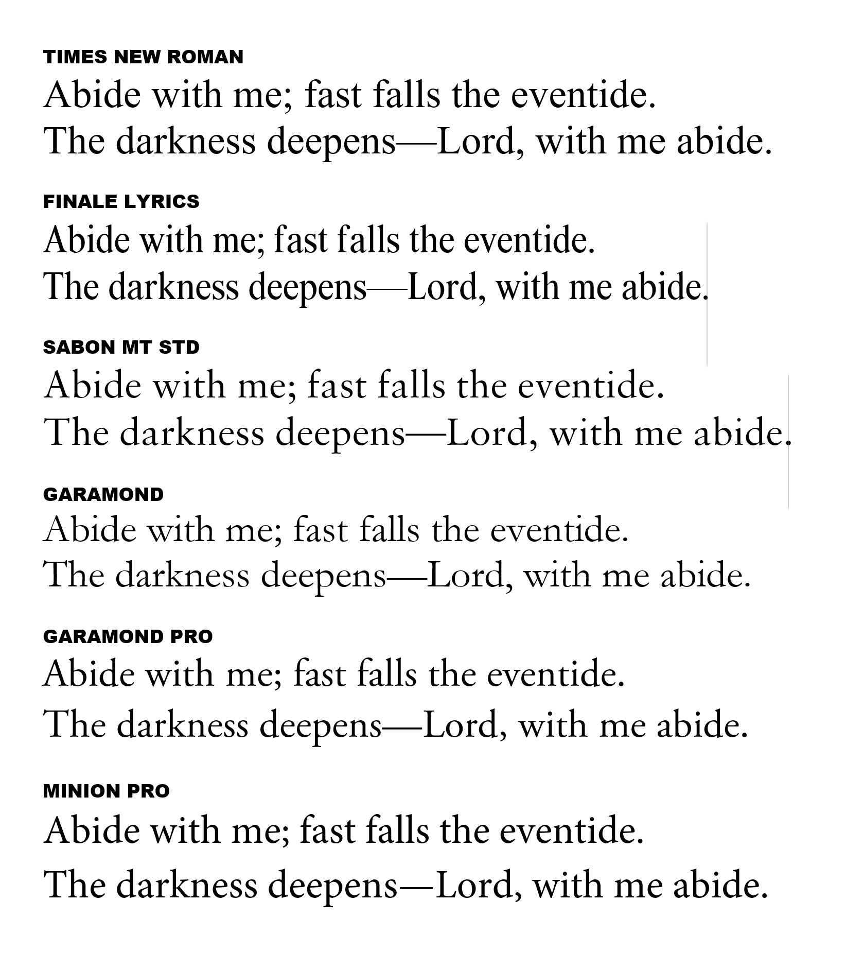
Times New Roman is the most widely-recognized font in the world, and its wide kerning and character width are great for legibility. But I felt its sharp terminals and variation in stroke weight rendered it outdated and apathetic. Many other modern fonts are based on old type (like Garamond and Baskerville, but they have aged much more gracefully than TNR.
Finale Lyric is a compact font that is dark and slender. Ultimately though, it looks like a condensed font. I’ve found it isn’t best for either legibility or aesthetics, as it appears cramped and stretched.
Sabon, by contrast, is significantly wider—10% wider than Finale Lyrics, and the widest font I considered. It’s the font used in the 1979 Book of Common Prayer. But both it and Garamond favor a light stroke weight which hinder legibility. Garmond Pro was tempting because of its weight, and because it conserves space without appearing cramped.
Ultimately I went with Minion Pro (9.8 point, fixed size). It has a pleasing stroke weight that never gets too thin, so it shows up well. Minion Pro is commonly used, and it doesn’t appear quirky or overly unique. Its serifs are thick (which conveys modernity) and angular (which conveys a classic sort of gravitas), It is wider than Garamond and Garamond Pro, but its x-height (the height of the lowercase letters) is much higher, which makes the letters appear larger. In fact, I began the first edition in Garamond and switched to Minion Pro partway through, and the improvement in appearance was dramatic. I’ve been so pleased with this font, both regular and italic, that I’d be hard-pressed to change it for future projects.
For other text items, here are the font settings I used (all in Minion Pro):
- Song title: 22-point
- verse subtitle: 8.8-point italic
- navigation text (chorus, return to beginning, etc): 8-point italic
- text and music attributions: 8-point
- copyright info: 6.5-point
- tune name: 8-point
- poetic meter: 7-point
There are of course other excellent fonts to choose from, each with a subtly different character. Here are several I’d recommend:
- Garamond Pro: a lower x-height than Minion Pro, but if you use a nice print process (or bigger font size, or both), it’s an elegant and classy choice.
- Gentium Book: a more angular, modern take on the classic serif type. Nice, understated italic to match.
- Libre Baskerville: based on the 1941 Baskerville font set, but with a taller x-height. And an awesome lowercase “g.”
This may seem like an abrupt postscript, but I left Finale’s default font set, Engraver, unchanged. I experimented with Maestro (Finale’s older font set) as well as third-party sets like November, but I ultimately found Engraver entirely sufficient.
6. Lyric baselines
Lyric baselines refer to the vertical positioning of the lyrics below the staff. STW has adjusted baselines of 12.8 points; that value is the distance between the baselines of the lyrics in successive stanzas. Baselines obviously affect both legibility and space efficiency. The document baselines for STW are as follows:
- Verse 1: -36 (0.5 inches below the staff)
- Verse 2: -52
- Verse 3: -68, and so on.
While the baseline distances between stanzas are a static element, the lyrics as a whole always require some vertical adjustment relative to the musical elements on the staff.
7. Second voices
Here conventions between American and British hymnals differ. British hymnals tend to use voice two for all alto and bass parts (downward stem). American hymnals tend to omit voice two except for unisons, seconds, and differing rhythms. Some formats combine the interval of a second into one voice, but this is uncommon and should generally be avoided.
Our hymnal followed the American convention of combining soprano/alto and tenor/bass voices except for unisons, seconds, and differing rhythms.
An error to avoid is the freezing upwards of stems when a second voice is present for part of the measure and hidden for the remainder. Stems should point in the correct direction even if a hidden voice is present. In this example, all circled notes have stems that are incorrectly frozen upwards:

Dynamic Elements
1. Note and syllable spacing
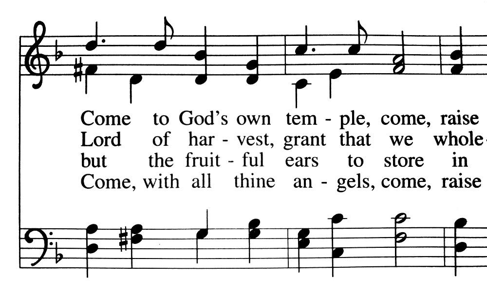
Among dynamic elements—aspects of music engraving that require adjustment subsequent to the creation of the style template—none are as important or as overlooked as note spacing. The principle to remember is that notes, not lyrics, determine note spacing. Errors abound in this arena, even in a hymnal like Evangelical Lutheran Worship that is otherwise a work of art. Here’s one example from ELW. You can see the quarter notes in the bass clef are unevenly spaced:
Here’s a similar example from Lift Up Your Hearts:

In the second measure, the eighth note in the bottom staff is spaced further than the quarter note that follows it. And in the third measure, the quarter notes in the bottom staff are unevenly spaced. Here would be a more visually pleasing rendering of the passage:

Note that in the second measure, the relative distance between the dotted quarter, eighth, and quarter are now much more proportionate. Their distances are not strictly equivalent to their duration, but they appear “naturally” spaced. There’s actually a good explanation for why the spacing seems “right”:
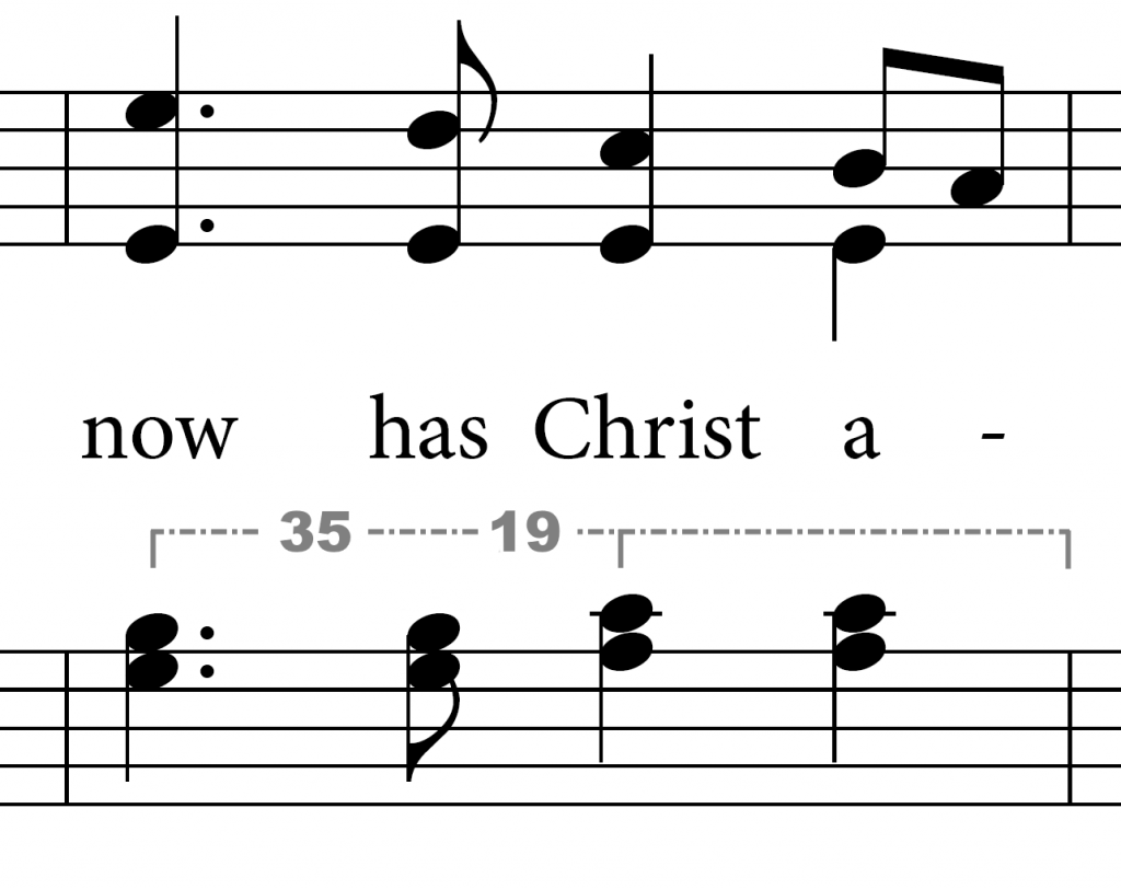
You can see that beat 3 forms the midpoint of the measure (measured from the middle of the first notehead to the right barline), and beats 3 and 4 are evenly spaced. In the first half of the measure, the dotted quarter and eighth at spaced in a ratio of 35:19. If the spacing of the eighth note were precisely based on duration, it would be 11.7 units wide. But a distance of 19 is an adjusted spacing by a factor of 1.63—almost exactly equal to the golden ratio!
Such an ideal is not always achievable, of course. But it’s a helpful explanation that quantifies spacing not only as a means of rhythmic clarity, but as an objective aesthetic principle.
The incorrect examples above arise from the fact that Finale and Sibelius automatically space music to avoid collision of all elements, including lyrics. The result is, often, uneven spacing of notes that are of equal duration, especially when the syllable count per line is high (as it usually is with hymnals). Here’s an example of automatic spacing that avoids lyric collision and spaces, with no manual adjustment, yielding a poor result:

Again, problems abound here.
- In measure 1, the distance between the successive quarter notes is unequal, and the dotted quarter appears shorter than the quarter that precedes it. The final eighth note is too close to the barline.
- In measure 2, the second quarter note in the bass clef is spaced to the right, creating an unequal distance between the successive quarters. And the soprano eighths on beat 2 are compressed together.
- In measure 3, the first three beats are unevenly spaced, and the final eighth note is too far from the barline.
- Measure 4 displays the most common spacing error in hymnals, involving two quarters and a half note at the final measure of a line. The note are equidistant from one another, but the resulting space after the final half note is a fraction of what it should be.
Mathematical beat spacing is not required; that is, a half note does not need exactly twice as much space as a quarter note. In fact, relative note spacing is generally preferable. And without lyrics, Finale’s spacing algorithm usually produces a clear and pleasing result. But the errors in the example above are more than just preferential—they directly affect rhythmic clarity. Spacing should reflect the relative rhythmic relationships between notes of the same or different time values. Here is the same excerpt, with manual spacing applied:
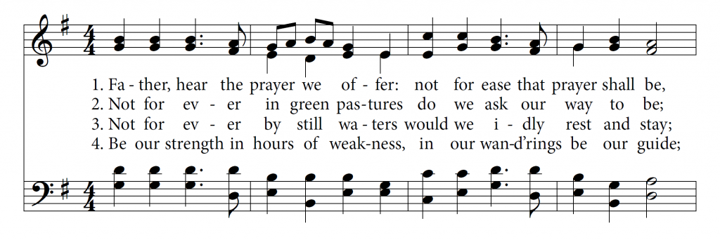
Relative spacing is still present, but the rhythms are no longer obscured by uneven spacing. You can see that lyrics are not overly crowded, although they do sometimes collide with one another between verses. Compare “prayer” in measure 4 verse 1 with “wand’rings” in measure 3 verse 4; the lyrics overlap slightly, but the effect is not distracting to the reader.
Incidentally, the golden ratio was not achievable in the final bar because of the word “guide,” although the end result was close. Throughout this excerpt, several spacing compromises had to be made to maintain sufficient spacing between syllables.
This result requires extensive and tedious manual adjustment. The first example above is the starting point, followed by these steps:
- Turn off automatic music spacing.
- Manually space the notes in each measure to achieve a pleasing spatial relationship.
- Manually adjust syllables horizontally to avoid lyric collision.
Hymns frequently compress many syllables into a single line to conserve print space and keep the poetic phrases intact when possible. One engraving professional I consulted told me he thinks of hymnals as poetry with music added. A good rule of thumb is 13 syllables per line. 14 is often also possible, which works nicely for hymns in common meter (8.6.8.6). But this compression often requires a trade-off in layout nuances. Since notes cannot be unevenly spaced and text can’t collide, the result is that syllables often cannot be perfectly centered under the note. Consider the final two words of verse 4 shown on the line in the example above, “our guide.” In order to avoid collision, both words are shifted slightly. The governing principle when making such manual adjustments is clarity.
2. Lyric alignment
The first syllables on each line should be left-justified. All other syllables in the line (including the final syllable) should be centered under the note before any manual adjustments are made.
3. Vertical lyric spacing
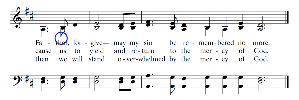
The vertical spacing of lyrics is important to the overall aesthetic of the page. The relative spacing of the lyrics depends on the innermost elements of the treble and bass clefs, typically inward-pointing stems. The following example is tight, but acceptable:

These distances aren’t fixed. If a hymn is slightly shorter than a page, baselines may be increased to avoid too much white space at the bottom of the page. Lyrics should also appear generally centered between the staves, even if the distance between closest elements in each staff isn’t the same:
4. Slurs
There is no real accepted convention regarding slurs. The first edition had no slurs, but I found their omission sometimes obscured syllable placement across melismas. I took the approach that clarity was the end goal, so in the second edition I slurred melismas across notes that were not beamed together; i.e., I beamed melismas across quarter notes or half notes, but not across eighth notes. If two voices shared a common rhythm and stem for a melisma, I provided only one slur, on the notehead side (this is a reasonably common convention).
5. Split measures
If a hymnal is best thought of as poetry, it’s worth noting that many internal poetic phrases begin on the anacrusis. When possible, it’s best to split the measure so the continuity of the poetry is preserved, even if some space is lost:
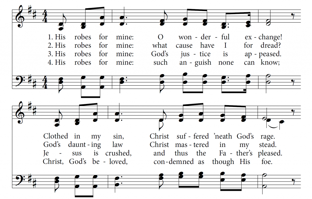
One of the advantages of a church making its own hymnal is that its compilers don’t need to achieve the same degree of compactness that a book of 700 songs would require. This freedom allows them to make layout choices like the example above without worrying about the resulting white space.
6. Hyphenation
The main thing to be said about hyphenation is that it should not be left to intuition. Some words’ hyphenations are obvious, and others are not. There are several online hyphenators like this one that work well (except for the word “ages,” which the hyphenator I used rendered incorrectly). A printed dictionary is best tool for checking hyphenations.
One perennial question is the hyphenation of “every.” I preferred to avoid the contraction “ev-’ry” and opted for “eve-ry,” since typically the second half of the word is best matched with the stress of “-ry” instead of the floating “e,” but there’s no universal consensus. Whatever you choose, keep it consistent.
7. Capitalization and divine pronouns
The current trend is to not capitalize divine pronouns (he, your, my, etc), as reflected in current grammatical practices and in most modern translations of the Scriptures. I opted to capitalize all divine pronouns with the exception of “who” and its derivatives. Again, consistency is what matters.
I also elected to not capitalize the beginning of a phrase unless it is the start of a new sentence.
8. Hyphens, em dashes, apostrophes, quotes
It’s important that em dashes are used to separate clauses when needed, not hyphens. These two punctuation marks are not the same.
Finale does not automatically convert tick marks to apostrophes or curly quotes. Properly rendering these marks (and the dashes mentioned above) requires either memorizing the Unicode keystrokes or utilizing a third-party hotkey generator, such as AutoHotKey.
9. Stem length
Many engravers would place this element in the “static” category—stem length is a fairly standard convention. Admittedly, this is an area in which I made some slight but unconventional adjustments. Stems are sometimes set as one octave in length (Finale sets them to 0.25 inches), but for downstems in the alto voice (or upstems in the tenor), long stems can eat up a lot of vertical space. As a result, I occasionally shortened stems to 0.20 inches.
Concluding thoughts
In the final estimation, even in the world of professional engraving, rules are relative. Some errors are egregious and make a project appear quirky and amateur, while other practices have no universal standard… and most rules fall somewhere in between. The important thing is to be humble enough to submit your opinions to at least a semi-public consensus, if you intend your final product to be broadly useful and accepted. And always keep two principles in mind: clarity and beauty.
